DIARY ENTRY
(1)
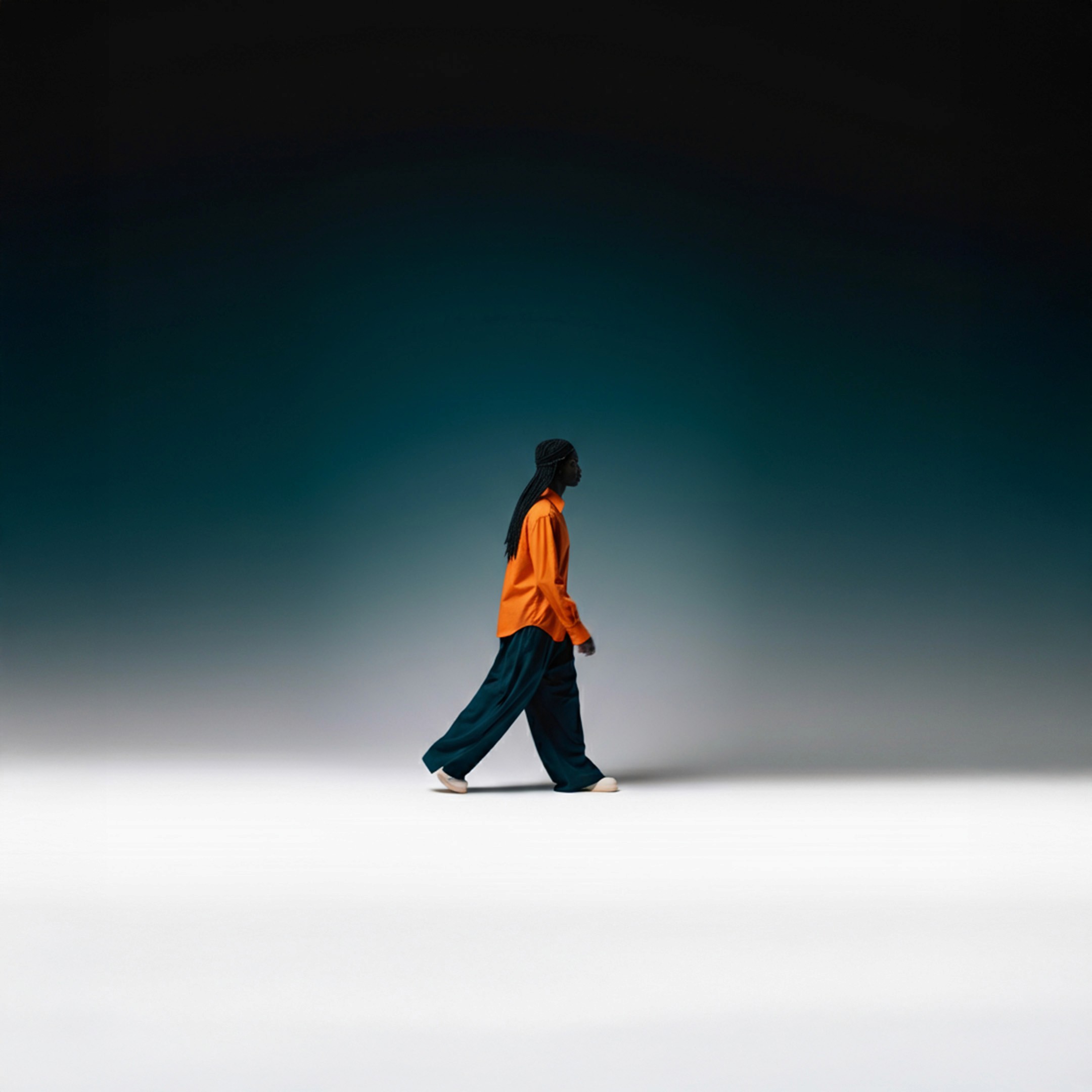
CAPTURING CONTRAST
There is something endlessly compelling about the way contrast and color theory travel across mediums, from the controlled chaos of a photoshoot to the precision of layout design to the tactile honesty of print. At its best, this is not just aesthetic decision making but emotional architecture. Contrast is often reduced to dark versus light, yet it is really about tension. Matte against gloss. Stillness against motion. Silence against saturation.
Strong creative work understands that contrast guides the eye, shapes hierarchy, and creates rhythm. Without it, even the most beautiful palette can feel flat. Color theory becomes powerful when it moves beyond the color wheel and into psychology. Complementary colors create energy because they hold visual friction. Analogous palettes soothe because they reduce it. High saturation commands attention while muted tones create intimacy.
The key is intentionality. Colors should reinforce narrative rather than follow trends. What feels bold in digital can overwhelm in print because light behaves differently on a screen than ink does on paper. Photography thrives on dynamic range while graphic design often requires controlled balance for readability. Good direction adjusts instead of applying one visual logic everywhere.
Discussion w/: Daniel Heighn